
Packaging Design
Minimalism Is Not Premium. Intention Is.
Sorted Branding · July 2025 · 3 min read
The advice that's quietly hurting your brand
Walk into any conversation between D2C founders and you'll hear the same piece of received wisdom repeated like scripture: keep it minimal, minimalism is premium. Muted tones. Lots of white space. A clean sans-serif. Done.
There's a problem. Minimalism is a design choice. Premium is a perception. They are not the same thing, and confusing the two is costing brands real money.
Minimal and premium are not synonyms
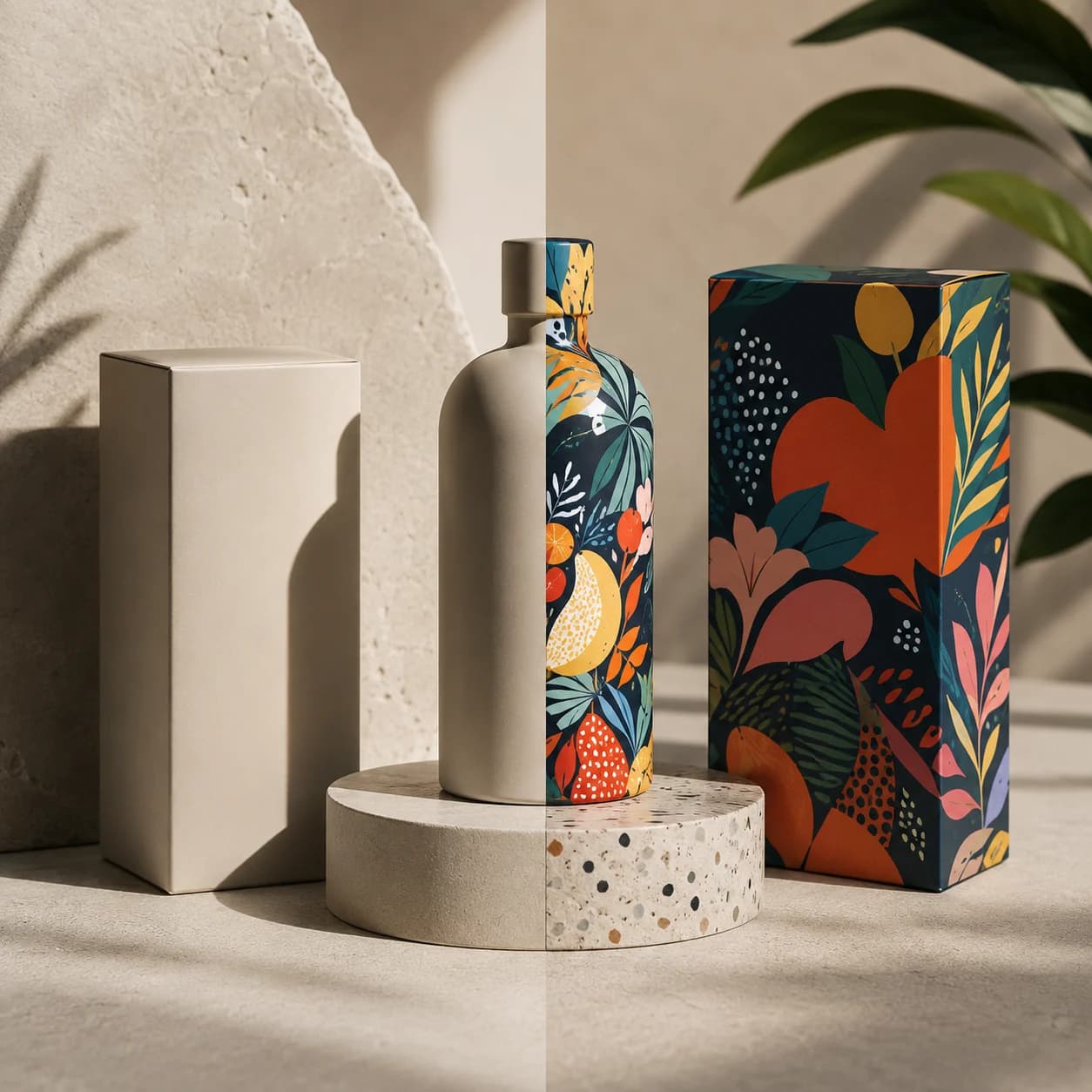
There is minimal packaging that looks cheap, and there is loud, maximalist packaging that feels unmistakably premium. Look at Paper Boat — every inch of the pack is covered in illustration, colour, and storytelling. It is dense, playful, and unapologetically maximalist. It also commands a premium in a category full of forgettable tetra packs. Look at Tony's Chocolonely — a loud, uneven, deliberately chaotic wrapper that breaks every rule of clean design, and remains one of the most recognisable chocolate brands in Europe at nearly double the shelf average.
Now look at the wave of clean-label D2C brands launching in India today. Minimal? Yes. But they all look identical. The same muted palette, the same sans-serif, the same empty space. And looking the same on a shelf isn't premium. It's invisible.
What actually creates the feeling of premium
Premium is not about how little is on the pack. It's about how intentional every element is. It's typography that has been genuinely chosen for the brand's character, not defaulted to because everyone uses it. It's colour that creates contrast on an actual shelf, not colour that merely looked nice on a mood board. It's a material and finish that feel considered the moment someone picks it up. It's a visual hierarchy that guides the eye exactly where it needs to go, in the order it needs to go there.
You can achieve all of that with a busy, maximalist design. You can fail at all of it with a minimal one. The number of elements is not the variable that matters. Intention is.
Why founders hide behind minimalism
Here's the part nobody wants to say out loud. For many brands, minimalism has quietly become a shortcut — a way to avoid making hard design decisions. Put a wordmark on a white background, add generous negative space, call it clean, and ship it.
But if you removed elements because you didn't know what belonged there, that isn't a design philosophy. That's a gap you're dressing up as restraint. True minimalism is ruthless editing — every element that remains has earned its place. False minimalism is just emptiness with better PR.
The takeaway
Be intentional. Whether your packaging ends up minimal or maximal genuinely does not matter — both can win, and both routinely do. What matters is that every choice on that pack was made on purpose, in service of how you want the customer to feel and what price you need them to accept.
The brands that understand this stop asking 'how do we make it look premium' and start asking 'what decision does every element on this pack represent.' That shift — from decoration to intention — is the difference between packaging that sits on a shelf and packaging that walks off it.
Feeling Stuck?
Want us to sort it out?
Book a free strategy call with Utkarsh — a straight forward conversation about your brand, where it's leaking, and what to fix first.

30 minutes · No pitch · Just clarity