OVERVIEW
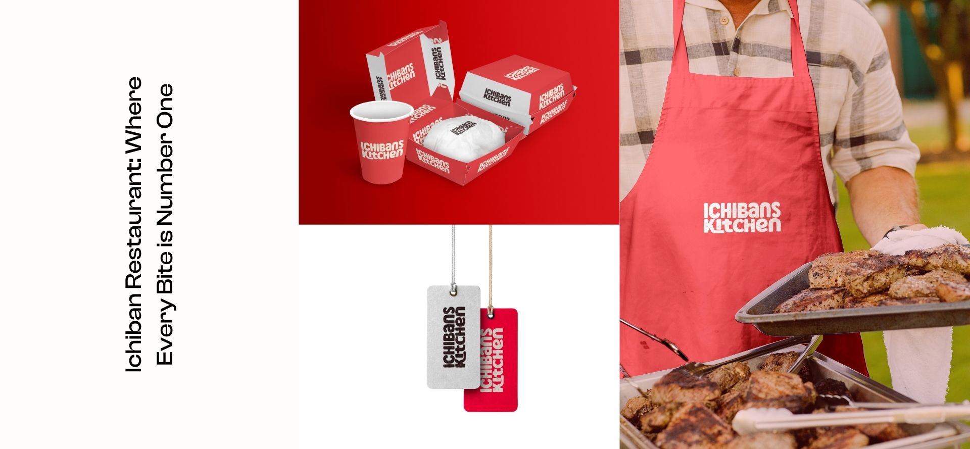
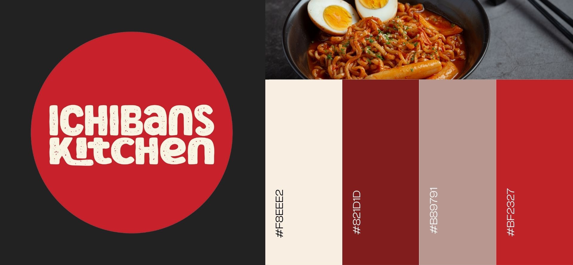
Ichiban is a vibrant restaurant known for its authentic Korean cuisine and welcoming ambiance. With a focus on delivering delicious dishes and a true taste of Korean culture, the restaurant aims to establish a strong brand identity through its logo design.
- Logo
- Branding
Challenge
The challenge for Ichiban is to create a logo that encapsulates the essence of Korean food while being visually striking and memorable. The logo should convey the restaurant's commitment to quality, tradition, and hospitality, capturing the attention of potential customers and leaving a lasting impression.
Solution


